
About
Imagine you’re a student who just finished their 8 a.m. lecture. You’re feeling extremely drowsy, and desperately need some coffee before your 9 a.m. class. You head to Starbucks, thinking that you can put in a quick order online on the way. But wait! UCSD's Price Center Starbucks doesn’t accept app orders, which will make it hard to order your heavily customized drink! And when you arrive two minutes later, the line is out the door!
UCSD's prototyping class asked students to create a kiosk that would improve the user experience in an area. We chose to create one for Price Center Starbucks, since it is constantly busy, wasting students’ precious time. A kiosk would help reduce wait times and simplify the ordering process.
The Problem
From our online literature review, we found that:
- 88% of people admitted to leaving a line after waiting for more than 4mins (Kioware)
- Increased wait time for college students leads to customer dissatisfaction (Sarpong)
- 33% of college-aged students (18-24) preferred services that were not face-to-face (Sands)
- A majority of customers prefer kiosks and have high regards for them (Datacap)
Thus, we concluded that implementing a kiosk at a busy restaurant would likely have a positive impact.
From our fieldwork observations, we found that:
- Lines are typically the longest around mornings and early afternoon, at times extending out the door.
- When waiting for drinks, customers crowd around the tables and take up large amounts of space.
- The total wait time, from getting in line to getting your drink, can take up to 24 minutes.
- Lines are typically the longest around mornings and early afternoon, at times extending out the door.
- When waiting for drinks, customers crowd around the tables and take up large amounts of space.
- The total wait time, from getting in line to getting your drink, can take up to 24 minutes.
“I think ... there have been times where the line was going pretty far out, and then I just kind of give up.”
We interviewed 5 users onsite to better understand the pain points of the ordering process. All interviewees expressed dissatisfaction with long lines and wait times, and all have left Starbucks without ordering something at least once. 4/5 interviewees mentioned that they dislike how the PC Starbucks doesn’t take mobile orders through the Starbucks app. Additionally, 3 interviewees mentioned that a kiosk could be beneficial by allowing customers to easily customize their drinks without having to speak to a cashier.
The Solution
We identified key ways to solve these issues.
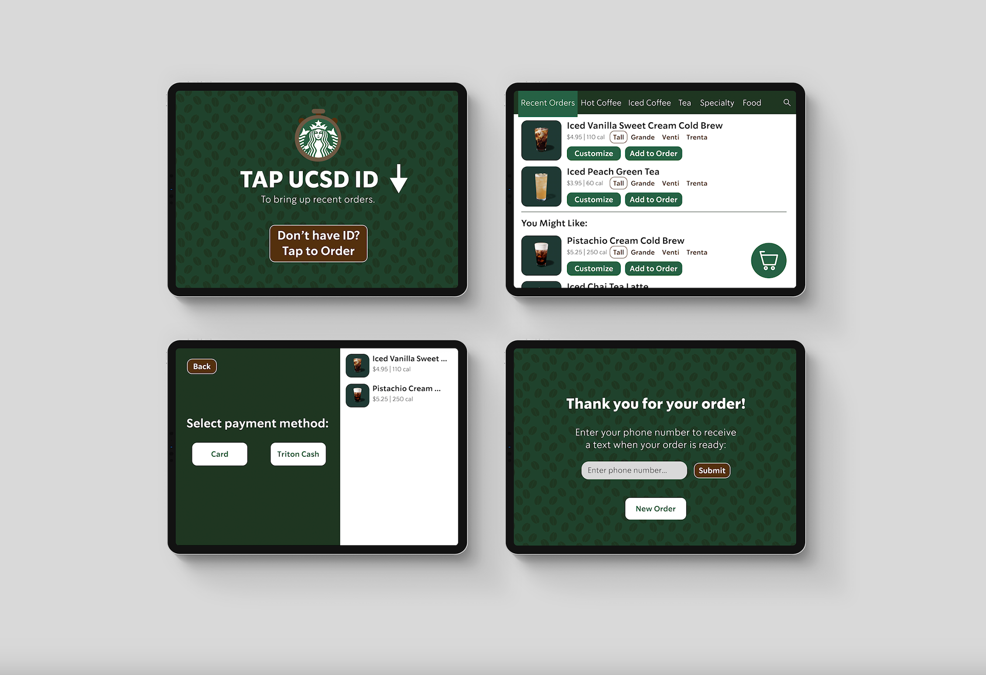
Student ID-based ordering system.
Students can tap their ID on the kiosk, and their recent orders will be brought up. This saves time and makes ordering a highly customized drink much faster.
Text-based order pickup.
We included a field for users to enter their phone number for order updates. That way, they could wait outside to reduce crowding, or sit down to begin studying without worrying about missing their order being called.
Role
Research
I worked on the online literature review and contributed to the initial fieldwork. I also conducted several of the user interviews and created the questions that we asked.
Prototyping
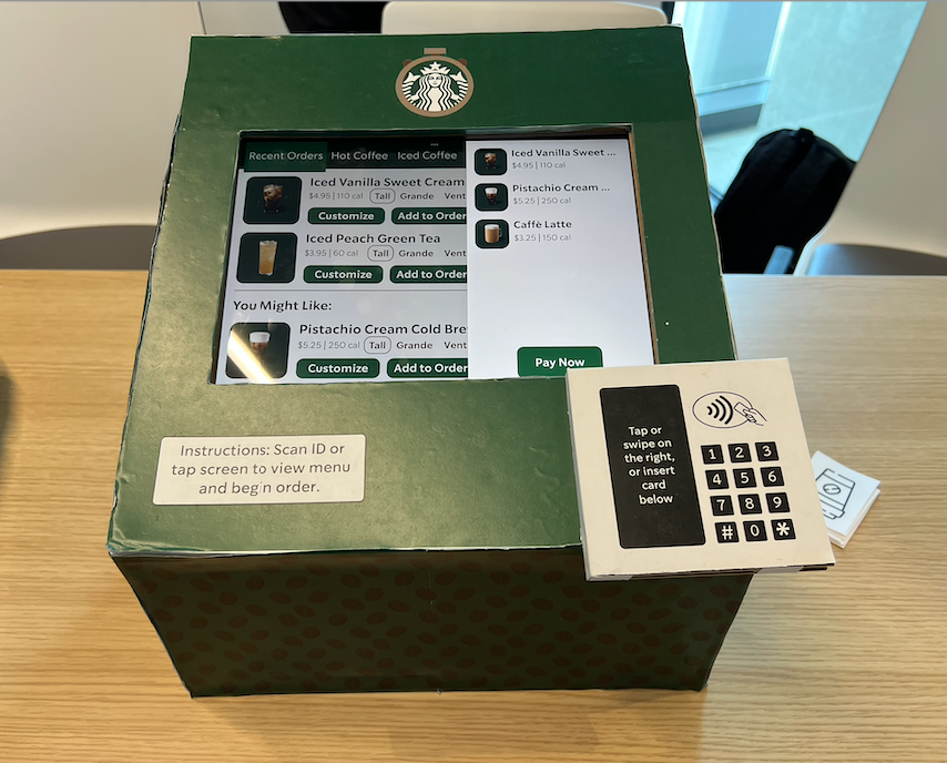
I designed both the lo-fi and hi-fi prototypes of the kiosk interface in Figma.
User Testing
I created a lo-fi prototype of the kiosk interface to ensure the users would understand the information flow. In class, we tested the prototype on several students. We gave them specific tasks to complete, recorded them, and asked for their feedback. Based on feedback, I added a "back" button, implemented tabs in the task bar to differentiate pages, and made the order details a separate overlay that appears when you click the cart button.
Once I had created the hi-fi prototype and a teammate had created the physical prototype, my teammates conducted user testing onsite with 3 participants. Most of their feedback were issues that we would update if we moved on with the product, such as making the search bar functional, but we did decide to update the wording on the first screen to reduce confusion.